HEYBO OUTDOORS
Back To Their Roots
A strategic brand refresh meant to strengthen and elevate existing assets, and realign the brand to their core audience and company values.

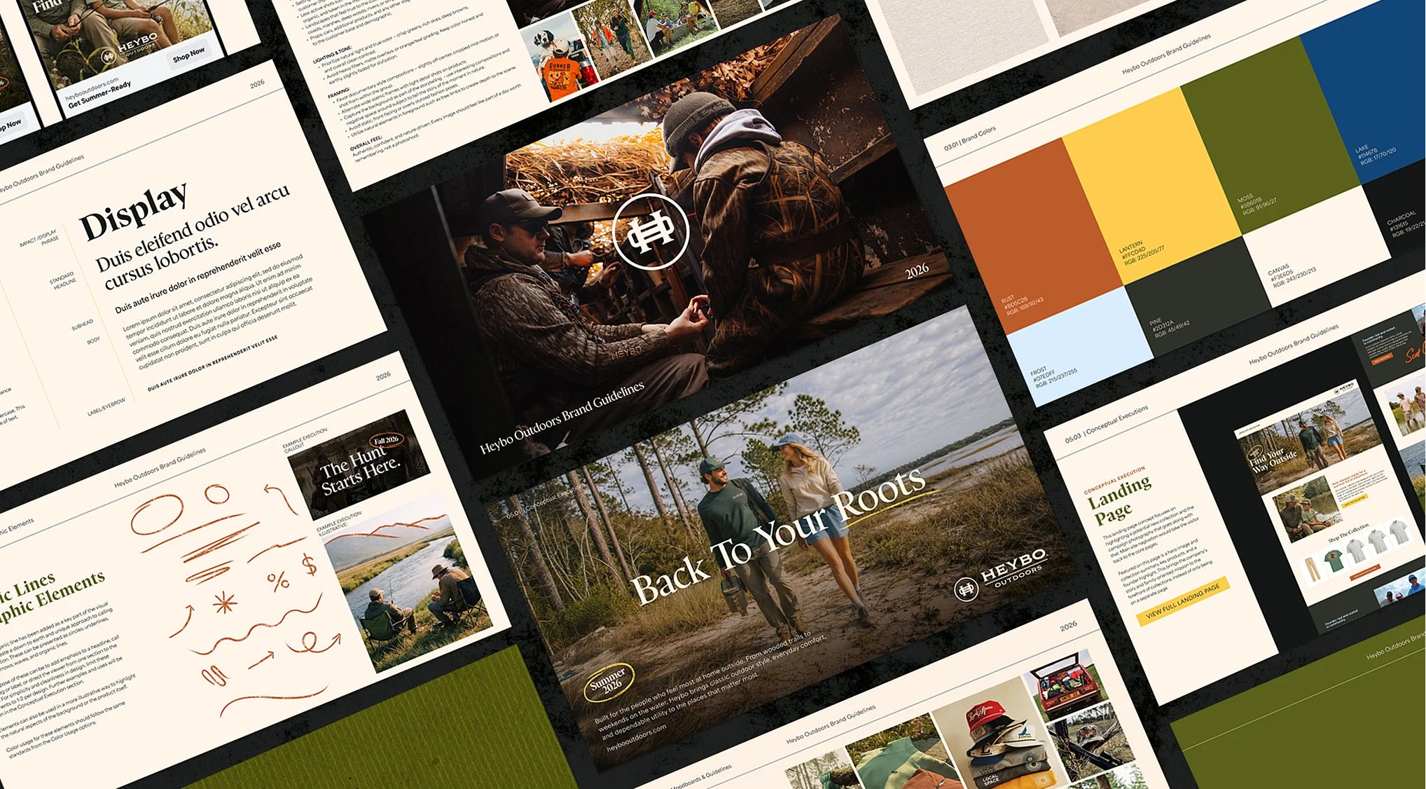
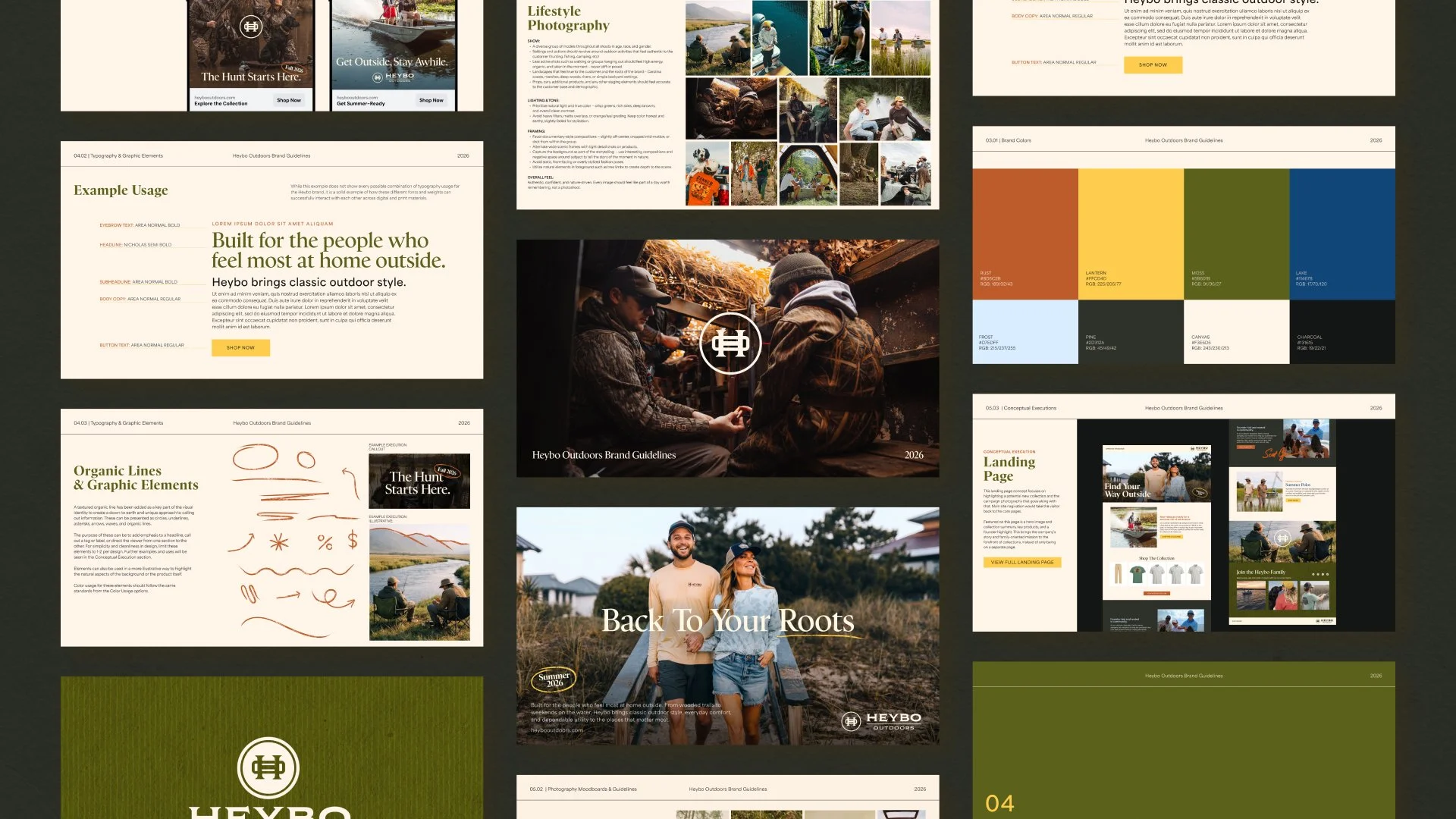
Updating the design direction while staying true to the brand’s core identity created a visual direction that felt authentic to Heybo’s customers and true to its down-to-earth roots.
For this rebrand, the logo stayed the same as a constant for brand recognition. The color palette was reimagined with inspiration from nature. Typography was redefined by mixing classic serifs with clean, legible sans serifs, creating a balance of old and new, or heritage and innovation. Hand-drawn elements were introduced as accents to add a tactile feel and reinforce Heybo’s rugged, adventurous nature. Photography guidelines were also redefined to prioritize real, raw moments spent outdoors.
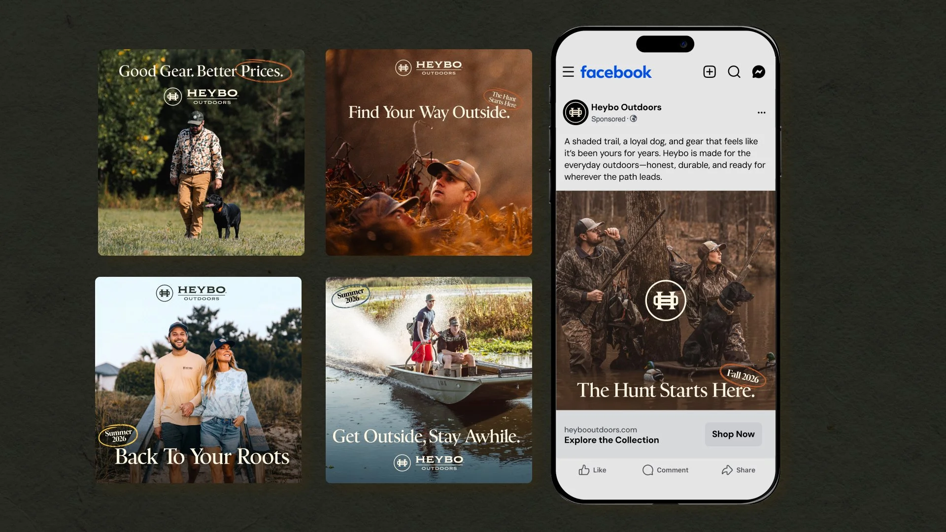
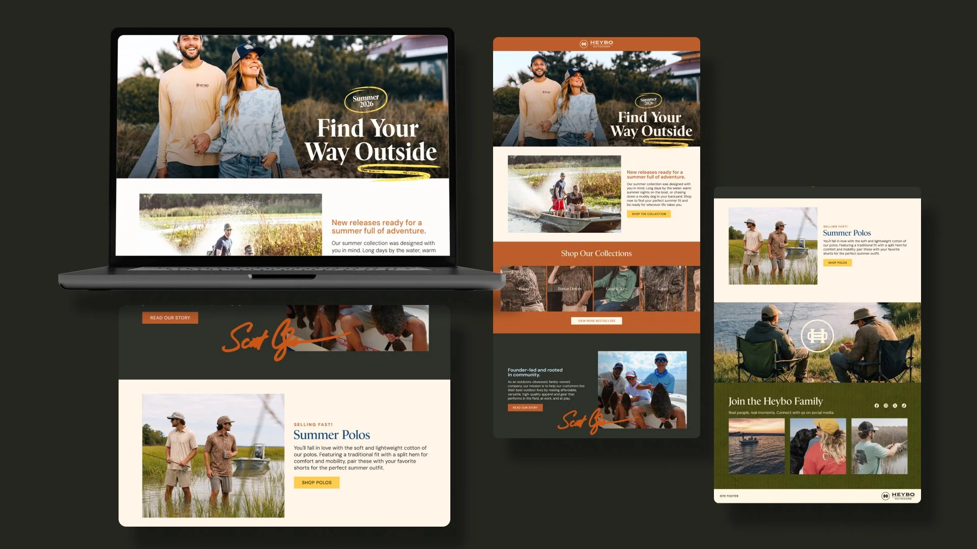
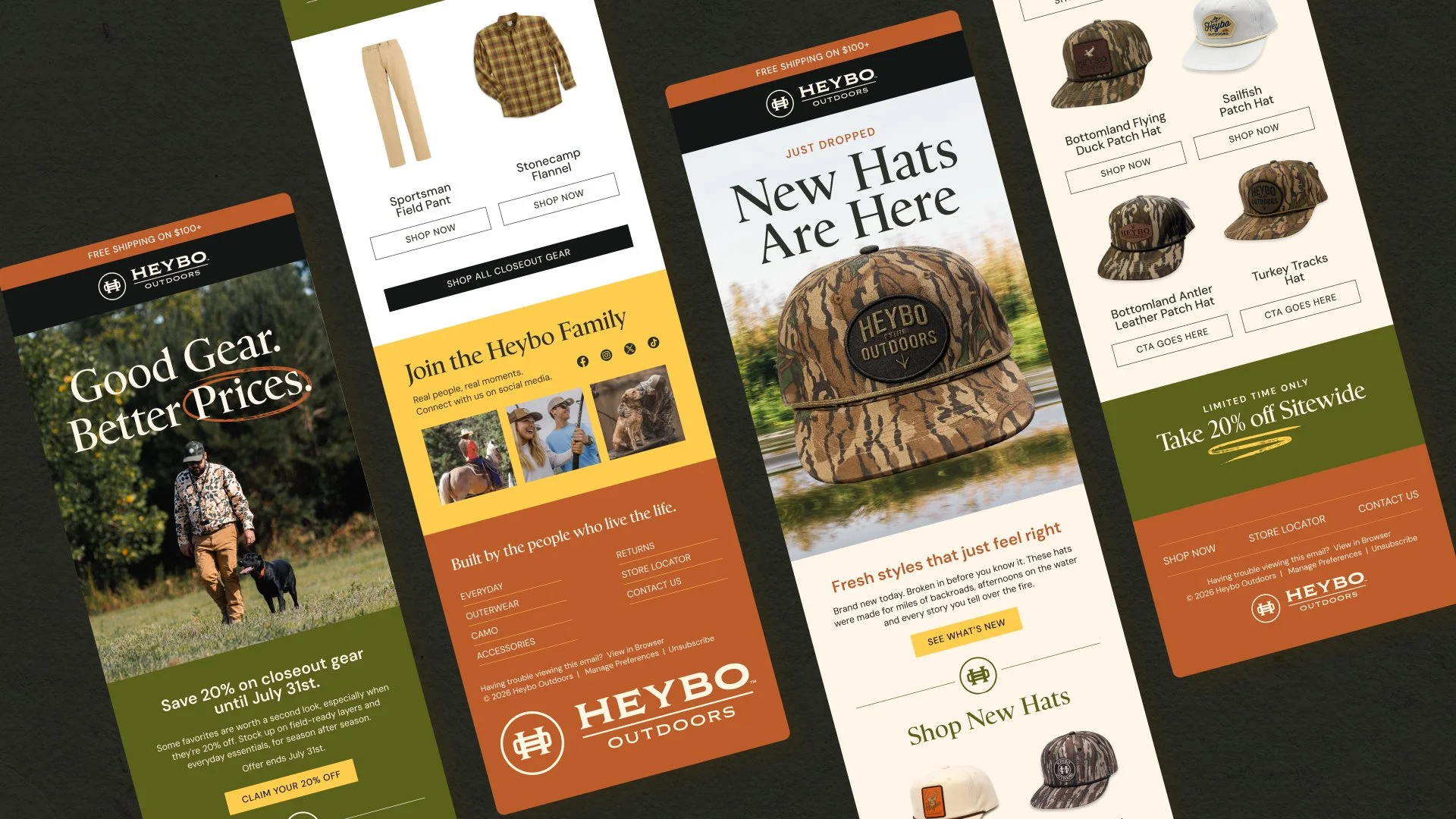
Whether it’s an adventure, a leisurely evening, or a yearly escape, Heybo is for anyone who appreciates time outdoors. This refresh was designed to reflect that and better connect with the people who make up the Heybo community. Following the rebrand, all digital media was updated, including landing pages, website, social media, paid ads, and email. This refresh marks a new beginning for Heybo Outdoors and a chance to connect with its customers in a more meaningful way.
A refresh rooted in authenticity
Heybo Outdoors is a family-owned brand built from the ground up, with a strong focus on connecting with its customers. When that connection started to feel lost, the issue came down to the brand guidelines and design system. The solution was to refresh the visual identity to better reflect the brand and the people behind it.